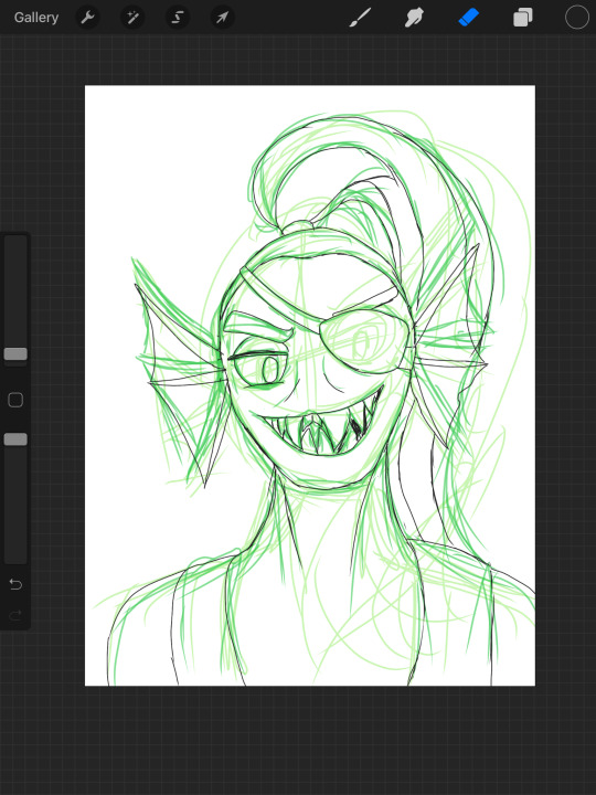
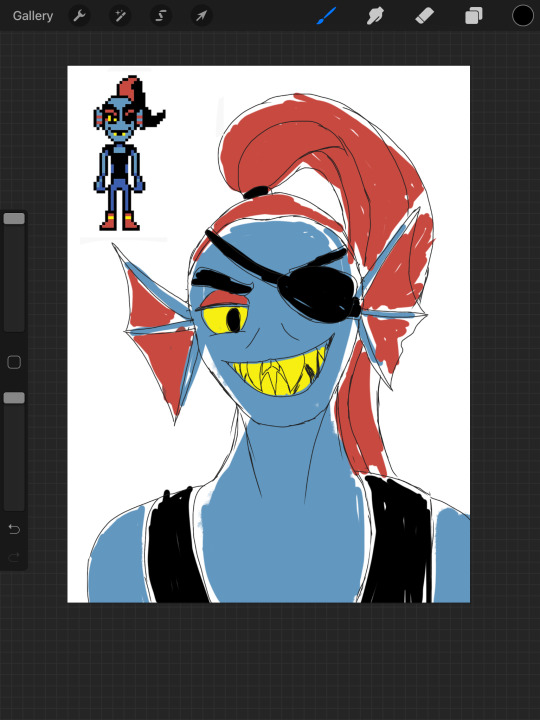
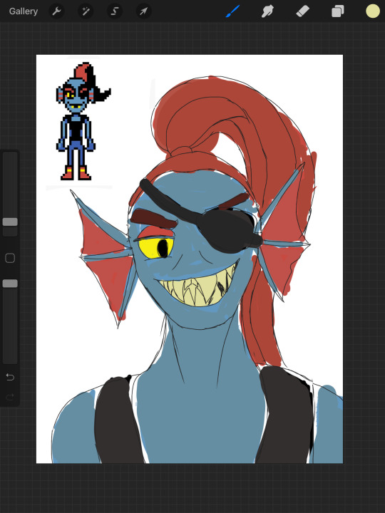
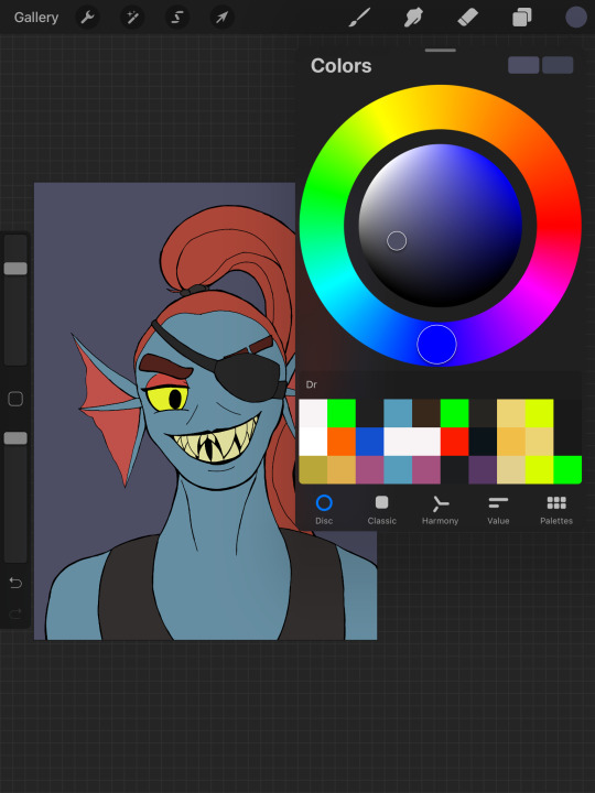
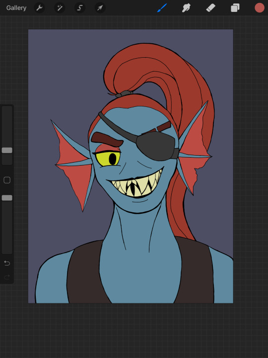
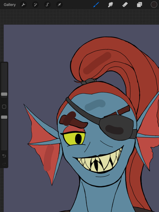
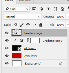
#once again decided to mess around with gradient maps!
Explore tagged Tumblr posts
Visit Tumblr Blog
Explore Tumblr blogs with no restrictions, modern design and the best experience.
Last Seen Tumblr Blogs


Fun Fact
Total funding amounts to $125.3M.
Text

did another sketchy pic, this time for my friend @darkmoon-dolt of her Jewel
+ alts


#pentadraws#art#furry#friend's oc#once again decided to mess around with gradient maps!#also even tho the first pic is more accurate to jewel's colors i feel like the second pic has a more cohesive palette#3rd pic is just what it all looked like under the filters. yet again#i need to practice more dynamic posing soon. make my art more interesting#ok i must go eat and sleep naow bye!!!!!
64 notes
·
View notes
Text
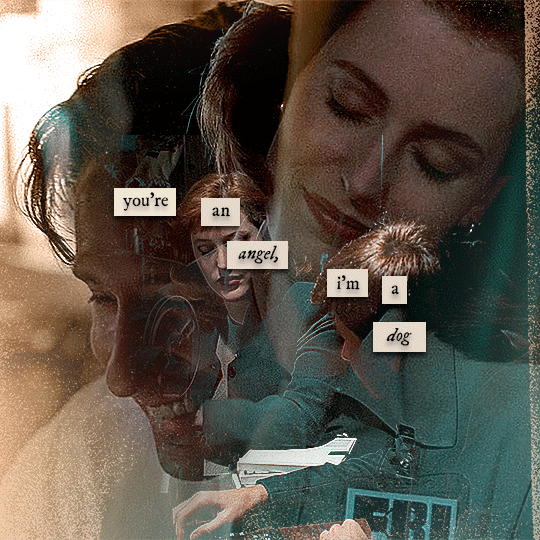
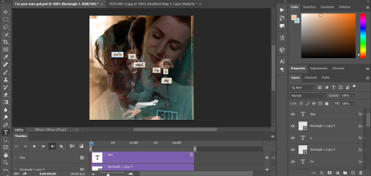
gif tutorial
@bakedbakermom requested a tutorial on how i made the gifs in this set, so i've put together a little walkthrough of the process for this gif under the cut!
(disclaimer: this tutorial assumes that you already have basic photoshop/giffing knowledge - i.e. how to make and colour gifs using correction layers, how to use things like layer masks, etc. if you don't, i recommend these tutorials, they're very comprehensive)
alright! so as stated before, i'm not going to go in-depth here on the basics of gifmaking. for this one in particular, i blended three gifs, but we'll get into the third one later.
(i should also mention that blending gifs as i did here is usually easier if you have scenes with shadowed/dark areas like the ones above, so to keep that in mind when picking your scenes! i also find it easier to use scenes where there isn't a whole ton of movement going on- again, not a requirement but it's easier to plan and position gifs if the characters aren't moving across the whole canvas)
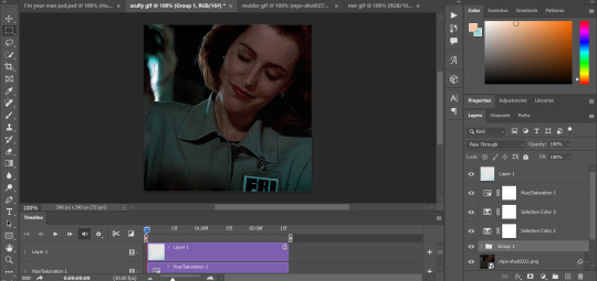
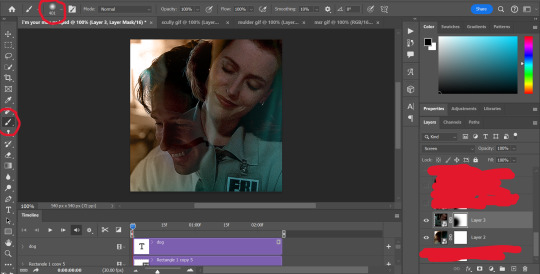
first, i started by making the base gifs of mulder and scully in "paper hearts". both are cropped to 540x540 px, and the same length (around 50 frames). i did some standard sharpening, brightening, and adding contrast (my usual process is curves, a b/w gradient map set to "soft light" at around 20% opacity, and messing with the levels a bit) before using selective colour and hue/saturation layers to highlight the teal and peach colours in the gif. sometimes this is enough colouring on its own, depending on the gif and the look you're going for, but in my case i wanted to add more.
so, on top of my colouring, i used a combination of layers set to "colour" and "hard light" to paint over the background of my gifs in teal and peach. on mulder's gif i also used a gradient fill layer in the two colours set to "colour" and used a layer mask to erase anywhere i didn't want the colour to be. the opacity levels for all of these layers again just depends on how vibrant you want your colours, i just mess with that on a gif-to-gif basis.
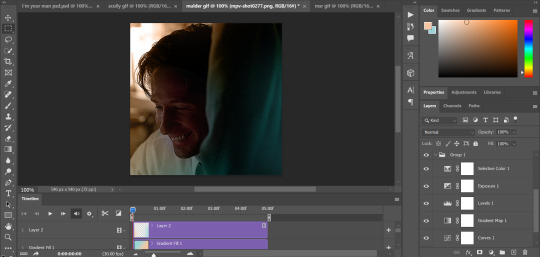
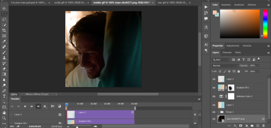
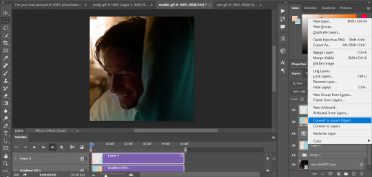
so we have our two gifs, cropped and coloured to fit the palette we want. next, i converted each coloured gif into a smart object, by selecting all my layers, right clicking, and hitting "convert to smart object."
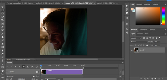
once that's done, you should be able to click and drag one of the gifs onto the other gif's canvas, so that it's sitting on top. then change the blending mode of the top gif- most people use lighten or screen, this again depends on the look you want and the gifs you're using. for this one, i used screen. it'll probably look something like this:
at this point you can move your gifs around and position them as you like. for mine, i just moved scully a little off to the right, as you can see. in order to get rid of the part that's covering mulder's face, i added a layer mask to the scully gif and used a large, soft brush set to black to erase it.
(another note: i didn't need to do it here, but if you want to move/erase parts of your bottom gif, add a layer of solid black underneath both gifs.)
usually i would stop blending here, but for this set i decided to add a third gif, so i made and coloured the gif of mulder and scully holding hands, using the same methods as the first two. this one was cropped to 540x405 px to make it fit better on the canvas, since i knew i only wanted it to cover the bottom part.
i converted it to a smart object and dragged it onto the same canvas as the other two gifs. this time i used "lighten" as my blending mode, positioned it in the bottom right corner, and again used a layer mask to brush away the parts i didn't want.
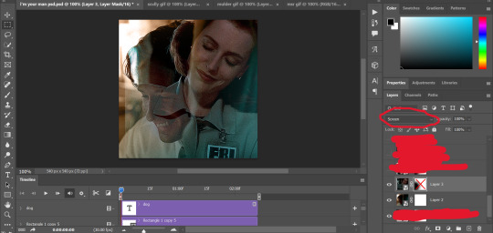
on top of all three gifs, i then used layers set to "normal" and "hard light" to brush some extra colour onto the gif. this part i also just play around with on a gif-to-gif basis, but for this set i mostly used a combo of colour, hard light, and normal layers at varying opacities until i got the look i was going for. i generally just like to use big soft brushes to add colour around the edges, as i did here.
now, i have a bunch of texture/grain pngs saved on my laptop that i like to add to gifs for some extra flair, so i opened one of those and cropped it down to 540x540px. i then added a gradient map to give it that peach colour. (any textured png/jpg should work fine for this, as long as you have your gradient map set to black and white/your accent colour)
like i did with my gifs, i converted the texture + gradient map to a smart object and dragged it onto the shared canvas. i set the blending mode to "screen", with the opacity at 70%. i like to put these textures underneath the extra colouring i've done on the gif, as seen here. i don't always do this, but i feel like it sometimes helps the texture blend into the finished gif. you can also use a layer mask if needed to erase any unwanted parts of the texture.
now for the text!
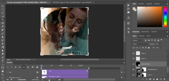
for these gifs i used the font "IM FELL DW Pica" in both regular and italic, in black, at 16px. i didn't do anything fancy with the text itself besides adding a drop shadow in the blending options (right click on the text layer and hit "blending options).
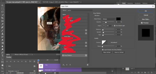
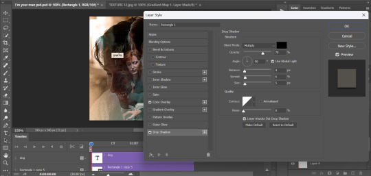
then, underneath the text layer (i was working one word at a time) i used the rectangle tool to draw a small rectangle around the text- i wasn't too picky about the size or evenness since i was going for a collaged look. i set the colour of the rectangle to a light cream colour, and added a drop shadow in the blending options.
then i just selected both the text and rectangle and duplicated them using ctrl+j, changing the text for each word and adjusting the size of the rectangles as needed. once i had all of the words on my canvas, i just moved them around until i found a positioning i liked. again, since i was going for a purposefully scrapbooked look, i didn't overthink this part.
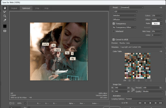
i exported my gif the way i usually do, with these settings:
and that's it! i used pretty much the same process for all the gifs in this set, give or take. hopefully this little walkthrough made sense, but i know i'm not always the best at explaining my process, so if anything needs clarifying feel free to shoot me an ask or dm!
88 notes
·
View notes
Text
hi! thank you so much, i really appreciate your words 😌❤ and yeah the set did take me some time to make like around two days asdfghjkl but i love how it turned out especially the green gif, and sorry for deleting the ask! i answered it but got anxiety of it not being the answer you expected so i decided to make a tutorial instead on how i did that set (blending and color manipulation), but first i’ll leave some links to some great blending and coloring tutorials down below :)
- blending tutorials
becca’s, soph’s (which taught me how to blend) and alie’s
- coloring tutorials
becca’s, hella’s and sam’s
(personally i use becca’s tutorials bc we work in a similar way and they’re super amazing and were a huge inspiration and help me out on how to make this tutorial)
okay so lil blending and color manipulation tutorial under the cut
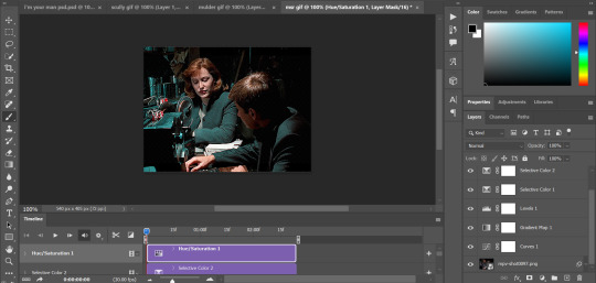
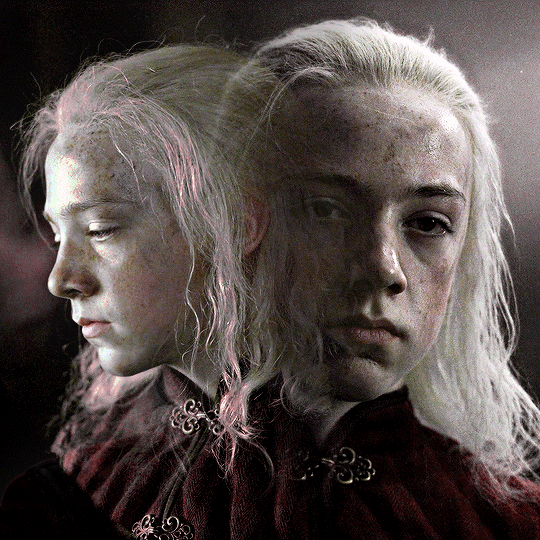
i’ll be using the first gif of the set you mentioned because it’s the one that needed the most color adjustments to get the red, other gifs didn’t need that much work and were fairly easy to get the color i wanted, so i’ll be going from this
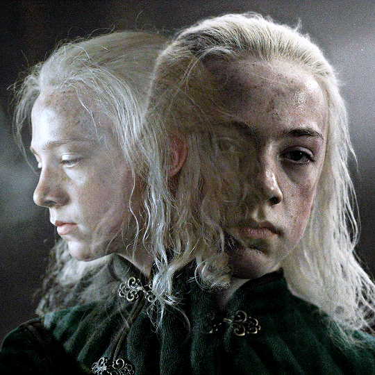
to this
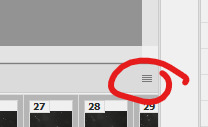
so starting, i work on each gif separately (crop, resize and color). the base gif will be the one where young aemond is looking to the front, tho honestly it doesn’t matter which gif you use as your base. once we’re satisfied with both of their colorings we go to the second gif which is the one of young aemond looking to the side, select both gif and coloring and click on the little folder on the bottom right corner highlighted with the red circle or just press ctrl+g on pc (cmd+g on mac i think)
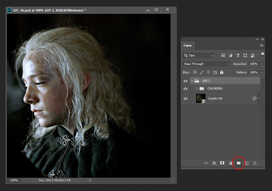
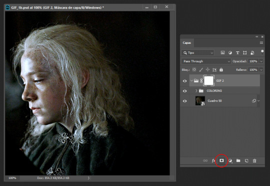
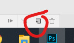
we name it as ‘gif 2′ to know which gif is it and to not get confused. then we add a vector mask by clicking the little figure highlighted again with a red circle. do these steps for all the gifs you’re planning to blend, as it will group them all separately without their individual colorings overlapping each other
then we duplicate it and send it to the base gif and set the second gif to ‘screen’, though sometimes setting it to ‘lighten’ works too, it all depends on the gif so play with both to see which one looks better (trama = screen)
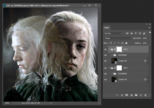
now is time to blend! for this i use a big brush like 200px, set to 0% hardness and 50% opacity, the bigger the brush and the lower the hardness, the softer the blending it’ll be, while using a smaller brush with an increased hardness, the blending will be sharper. we’re going to click on the base gif’s vector mask and with the brush set to black we’ll start to erase the left side of it, if we mess up then we set the brush to white by pressing ‘x’ and paint on it to correct anything. it should look like this
then we do the same with the second gif by erasing the right side and a little over aemond’s eye. personally i like to leave traces of both gifs so the blending looks smooth and nice. the end result should look like this
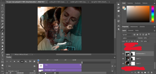
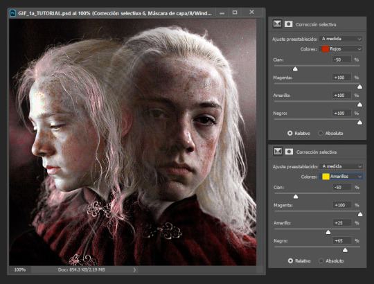
now is time to change aemond’s clothes to red! there are several ways to do this which is by using selective colors, hue/saturation, a gradient map or a new layer and paint over the gif, you can use one of these methods or several or all of them depending on your gif and the result you want to achieve. so we create a new folder atop our gifs and name it ‘red’ and create a selective colors layer, though the color isn’t that bright or strong i can see some green and maybe some cyan/blue tones on lil aemond’s clothes, so we adjust those colors to make the green pop up and set the selective colors layer to ‘color’, it should look like this
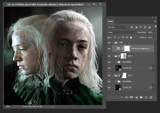
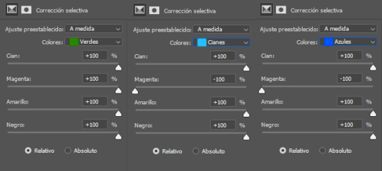
don’t worry too much if aemond’s face gets green and then red, we’ll fixed this later. now we create a hue/saturation layer, on the drop down menu we change the color to ‘green’ and drag the hue bar until the green changes to red or as close as possible to it, we do this for cyan and blues too (verde = green, cianes = cyan, azules = blue, sorry for ps being on spanish tho)
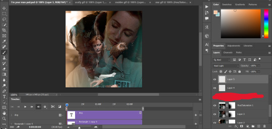
and voila! the green and cyan/blues had turned red
because the red looks dull and sad and needs to be brigthen up, we’re going to create a new selective colors layer and adjust the reds and yellows, like so:
you’ll notice that lil aemond’s face and hair has turned red, to get rid of that we’re going to pick up our brush, set it to black and start erasing those parts on the vector mask on our latest selective color layer. once you’re done duplicate twice that layer and drag one of its vector masks to our first selective color layer and the second one to our hue/saturation layer and delete the duplicates without vector masks, that way you don’t have to erase on each one of the vector masks again, just tweak each one to your liking, repeat this step for future layers
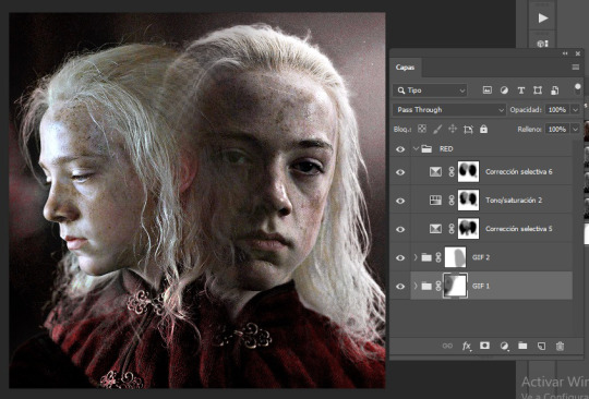
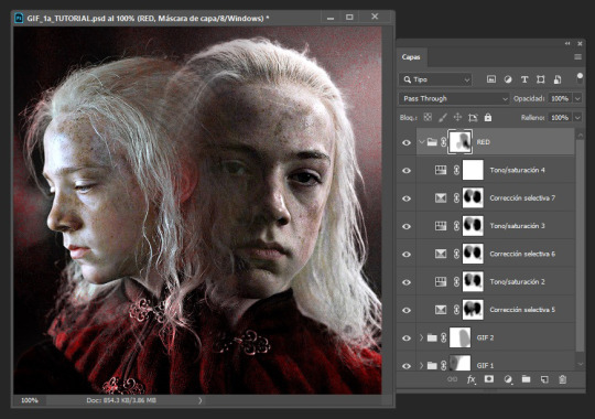
because i can see some yellow on left aemond’s hair and i want for it to be red so it blends with the rest of the color we then create a new hue/saturation layer, change the color to ‘yellow’ and set the hue to -65 and the lightness to +30. then we add a new selective colors layer and only work on the reds, we set everything to +100 though the cyan to -50. and lastly we add a new hue/saturation layer, change the color to ‘red’ and increase the saturation to +25. this will be the result. i’ve already done the step mentioned above about duplicating the vector masks
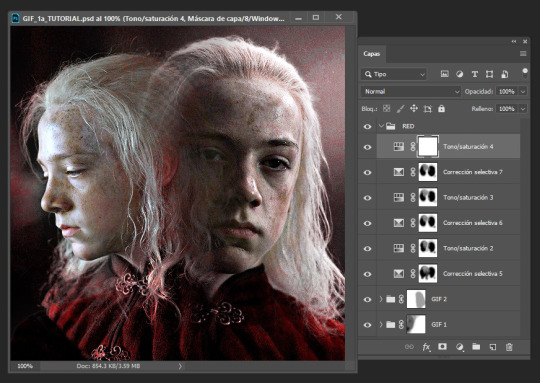
because there’s still some red on his hair and face and i’m lazy i select the folder named ‘red’, add a vector mask to it and just erased on it because i didn’t want to go and erase on each vector mask, too much work lol
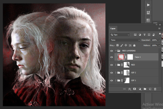
i could very much leave the gif as it is but i felt it needed like a pop of color around it because the background is kinda dull and not that vibrant, so we create a new folder and name it ‘red layering’ (i need to name things or else i get confused), create a new layer, choose a vibrant yet deep shade of red (i’m using #b80505), pick up our brush (200px, 0% hardness, 50% opacity) and paint the background and a little over aemond’s clothes, set the layer to ‘tone’ and add a vector mask, like so:
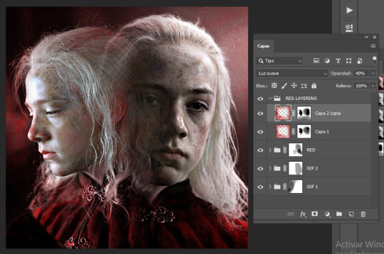
i like how setting the layer to ‘tone’ gives his hair a soft red outline on places that didn’t change to red, like around the top of his hair. so next we duplicate the layer, set it to ‘soft light’ and the opacity to 40%, and with our brush set to black erase any parts we don’t want, like a little on his hair, his face and over his clothes, and apply the step i mentioned about duplicated vector masks and tweak to your liking
for this type of gifs i like to set the speed to 0.06, and voila! the gif is done! you can add in some typography if you want to c:
worth mentioning that other gifs won’t need that many adjustment layers, like the purple and green ones for example they only needed two selective colors layers and a little bit of painting on a new layer to achieve those colors. hope this tutorial was of any help :3c
#usergif#completeresources#allresources#userwolfkissed#usernik#userbecca#tusercora#userelio#coloring tutorial#gif tutorial#tutorials#mytutorials#ps help
190 notes
·
View notes
Note
Your gifset with the boarders and circles is gorgeous 😍 Can you do a tutorial on it?
thank you! and of course, i’ll explain how you get this gif under the cut. this is probably gonna be very picture heavy because that’s how i learn things and i think it just helps to see each step.

so once you choose your gif(s), place them on the same canvas [540x575] and situate them where you want them.

then, create a layer mask on the top gif and use the soft brush tool to blend the two gifs together. it should look something like this.

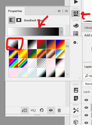
this is when i would color the gifs personally (though this “layer” of gifs is going to be covered with a gradient map, i think it’s beneficial to color now so you know what you’re working with, rather than having to change the gradient later.)
create a gradient map adjustment layer. change the color to whatever you want it to be, in this case, i chose one of the preset ones (purple 06). change the blending style to color.

and personally, i want to change the purple a little, make it a little warmer. so i create a selective color adjustment layer and mess with the magentas. now it should look something like this.

looking good, right? well, i want to make more changes because i think it looks too bright/white. i want this to be a good background, so i want it to be more dark and solid. so, above the coloring but below the gradient map, i create a solid layer of black and change the blending mode to soft light.

okay! onto the middle gif. i use the ellipse tool and create a 200x200 circle and use the alignment tools to make sure it’s in the middle of the canvas. next, i copy the circle layer, putting it underneath the first circle, and use the transformation tool to make it bigger. it happens to be 213.5x213.5 now, but it’s just personal taste for how big of a gap you want. change the properties so that it has a stroke of 4px and no fill. and then change the stroke option to be the dotted line instead of solid and mess with the gaps until it lines up the way you want it to. mine is set to be 5.59.
next, i add a drop shadow to that dotted stroke circle. these are my settings for them.

now that we set that up, copy that layer (not the original circle), and use the transformation tool again to make it bigger. mine is 238.7x238.7, and i changed the stroke to now be 5px. this messes with the dots, but all you do is mess around with the gap number again. now, it’s set to 5.57.
the way i decide how big the gap should be is by seeing when the next dot begins and doing the one before that. by using the arrow keys to go down by decimal points, you can see the exact shift in the circles. so for example, for the first one, having the gap set to 5.58, you can see the top dot start to deform. that’s the next dot coming out behind it. you want it to look like it’s perfectly spaced, so you set the gap to 5.59.
now, you can add the gif you want in the middle to the canvas. i just copied the same coloring i used before and added any adjustments i needed to make sure the gif looked good and then shift-clicked all those (the colorings and gif) and converted them to a smart object. then it’s just right clicking the gif layer and making it into a clipping mask so that it “fits” into the middle circle.

before i move on, i realized that i wanted the background to be darker again, so i create another layer after the gradient map but before the circles where i create a vignette like effect of just using the soft round brush on the corners, and setting the blending style to soft light at 50% opacity.

rectangle time! first, i always create a rectangle that’s the same size as the canvas and set it in the middle and then transform it to be smaller so that the proportions are always the same. this one happens to be 472.69x503.33. you get weird numbers most of the time since you’re just eyeballing where you want it to be. similar to the other dot strokes, set the size to 5px and then mess with the gap sizing until you’re happy with it. mine comes out to 3.15.
add a gradient overlay style to this one. again, i chose a preset gradient (purple 12) and set the opacity of the gradient to 85%.

for the other layer, copy that last layer and clear the layer styles. this should set it back to just before the gradient color. place the layer underneath the colored rectangle layer and change the fill to 0%. it’ll look like it’s not there, but it’ll be back, don’t worry.
add a stroke to this layer, set to 1px and 100% opacity. and now you should have the outline of the dots! i moved the layer using the arrow keys 1 to the left and 1 up to give it the offset look.

time for the text. choose whatever text you want, this is really all up to you! i have cherry and kisses for my top font and big noodle titling for the bottom font.
for the top layer, i wanted some color so i duplicated the layer (moving it underneath the original layer) and added a gradient overlay and drop shadow. then i shifted it over a few spots again to have it be visible.
for the bottom layer, i just added a drop shadow.

now, i just create a layer mask on the dotted rectangle layers and use the hard round brush to “erase” the dots that are behind the text on both layers.

and that’s it! if you have any questions, whether i missed something or something doesn’t make sense, just shoot me an ask/dm :)
happy giffing!
#tutorial#photoshop tutorial#gif tutorial#pstutorial#yeahps#completeresources#allresources#dailyresources#quirkyresources#hisources#uservalentina#tuserdi#userrobin#ref#ask#anonymous#star talks
111 notes
·
View notes
Note
Hella jealous of how you color your art. It always looks so nice!
I’m very flattered but a little confused :-)
But uh hey I know this isn’t part of your ask, but if it would be useful, here’s a look at how I do colors! I start with my sketch. Once I have a sketch close to lineart, I make a layer just for messing around with color. I take a ref of whatever character I’m drawing, and sample and drop colors directly from it. I map the colors on the sketch, but just basic shape.
Then I decide how I want the colors to change. I sample each color I want to mess with, adjust it in the pen color, and then color in that part of the sketch again to compare it. Here’s how the color wheel looks on Procreate:

You can see I started to adjust the hair color in this pic. I wanted Undyne’s hair to look a little more natural, and I thought the best way to do that would be to make it darker and less saturated. To make it darker, I moved down on the palette, to make it less saturated I moved left. I just did little adjustments until I found a color I liked.
I did this with every “item” in the drawing until I got these colors:
She started with four colors and ended with nine! I dulled and darkened her skin, lightened up the eyepatch and shirt, made the teeth a normal color, and made the eyebrows more of a dark red/brown! I have two considerations when deciding colors: How can I make each piece look unique? How can I limit the colors?
I made her eyeshadow, fins, and hair all different colors of red, since skin, makeup, and hair will have a different appearance. But I didn’t alter these too much so that they contrast with each other. The eyepatch and shirt were the same color, but to make the eyepatch look better on the face, I lightened it. I try to make it clear that each “piece” is something different, but the colors stay similar enough to each other that it doesn’t look like lots of things going on. Then I make my lineart and make new layers for color. I make each color its own layer in case I decide to change it.
After I’ve got everything colored, I do background. Background colors depend on what kind of background I want. If I’m doing a scene, I start with the basic colors, then I adjust those colors and the ones on the character until they look like they fit together. I try to make the character stand out from the background, but not so much the background is jarring. For simple backgrounds I do a solid color or gradient.
I git this one by starting with Undyne’s skin color, moving it towards the purple segment on the wheel, making it darker and less saturated. I changed this several times before I settled on a color.
Then I adjust all the colors again if I think I need to.
I lightened the eyepatch and darkened the eye and hair here. A note on shading: I take the base color and make it lighter+less saturated for highlights, or darker+more saturated for shadows. I do highlights and shadows on separate layers too, so I can adjust them individually. I wait until I’ve got the base shape of them filled out and the colors decided on before I merge the shading and base together and blend. In some of my drawings, I don’t want obvious lineart. In this case, I do one of two things. 1. I have no lines. 2. I do think lineart where the line is a different color depending on what color/”item” it is outlining. I choose these line colors by taking the base colors and making them darker.
Here are the colors I would use for that type of lineart for this drawing, against the base colors. It’s a quick look but I hope that’s helpful, or at least interesting to somebody! Jealousy is not the way bro, I’m sure your own color choices are good. Some people like pastels, or neons, or grayscale, they like dark or vibrant, and it’s all good! It’s just about what you like and what style you’re going for!
3 notes
·
View notes
Text
psd tutorial!!
okay guys so finally it’s here- today i’ll be showing you how to make any kind of soft psd! i will include an in depth tutorial with tips.
Part one: creating the psd.
step 1: find the image you’ll be using. now for me, i create psds based on the tone of the image. because i find that if you make a (in example) purple toned psd and try to add it to a warm toned almost orange-ish photo, it won’t look the best. step 2 (optional): find an inspiration! lately i’ve been really really inspired by velvestuff unnie!!! i really enjoy how visually pleasing and aesthetic her soft icons are. they’re literally perfection and i dont think it’s possible for anyone to try and replicate her edits. but it’s ok to be inspired! set goals. otherwise, you won’t really have a base to your edits. to create a purple/pink/brown psd in photoshop, it can be essential and effective yet optional to use the follower:
brightness & contrast ( main ): these two are mainly important for either brightening or darkening your psd. it’ll serve as a key factor.
vibrance: sometimes you’ll find your psd to be TOO vibrant and orangey. you’ll use this to tone down the image.
color balance ( main ): color balance is a huge factor in my opinion. it’s what will allow your photo to be either purple/pink toned or orange/brown tone. you’ll be seeing me using this a lot in my psds.
black & white ( main, if too contrasted ): to me, black & white substitutes as a contrast, but the good thing about this tool is that it’ll either tone down the red hues or make it darker, as well as the yellow hues.
photo filter ( main ): this’ll substitute the vibrance. you’ll see why it’s important by the end of this tutorial.
channel mixer: this will serve as a color balance option. it’s helpful for boosting red, yellow, and blue hues.
color lookup (sometimes optional): this tool will help get a color tone to your photos. let’s say i want something more pink; then i’ll use a pink color lookup and set the opacity low.
gradient map & solid colors ( main ): also important. serves as a color balance substitute and could tone down the vibrance or could raise the brightness. i always recommend using these in ‘color’.
i’ll be using this photo to start off:
step one: i’ll start off using the brightness tool. here i’ll lower the brightness down to -9 & the contrast to -23.
step two: then, i’ll proceed to add a solid color (aka color fill) of this shade. after doing so, i’ll change the setting to “color” and lower the fill to 37.
step three: then, i’ll proceed to use the color filter with these settings.
and so far we already have this layer lineup, and these are the results so far.

it’s up to you if you’d like to add more filters to your photos, but this is the base for a purple/brown psd that looks good on dark/semi bright photos and lq photos. i’ll continue on to add to this look to make it more purple and brown so follow along! step four: i’ve added a color balance layer and changed out the photo to test my psd to see how drastically it’d change: but it didn’t. but then again, since psd edits appear different on phone screens, i started to mess with the color balance to get a more purple look, so that the purple doesn’t get cancelled out on phone screens and still remains pretty. so i used the following settings:

i applied this color balance layer UNDERNEATH the solid color and photo filter layer, because if you add this on the top of everything, the blue will be overpowering. if you do not want a heavy blue filter on your edit, always apply a solid color, gradient, or color balance layer underneath a solid color that’ll lower the vibrance of your edit. and with this setting:
my outcome was:

and if you haven’t noticed, i did apply my softer action which you can find over here!
soo, now that you have the basis of your pink/brown/blue psd, you can continue to mess around with the same steps as before!
part two: tips
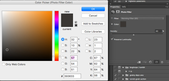
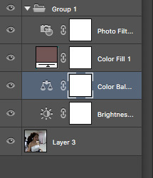
— stay away from hues. if you do decide to use hues, set the opacity to no more than 5%. this is because an overused hue can cancel out colors that’ll make your psd look decent. if you want to use a high opacity hue layer, at least use it on an image that you set your hue color to. (if i use a pink hue, i’ll use it on a pink photo) but make sure it’s not colorful, so it’ll look better on a pink and white photo [[like a cafe photo or ulzzang photo]]. because what the hue will do to a pink photo with brown in it is give the brown an unpleasant purple pink tone and i’ll just look not good. so overall: avoid hues. try to use the “color” option instead if you would like a color to pop more. — if you’re creating a soft psd, use a soft action! i’ve created one on my blog. an action is basically a group of <<literally>> actions created in photoshop. so lets say i want to take this sharpen and blur then noise i added onto my image, and apply it to another one; it cuts the work of redoing it over and over. so you just record what you want to be done to another photo and boom, you have an action! — keep in mind, you will always have to adjust a psd. even if you made a psd that looks amazing on a couple of photos with the same tones, one will always be maybe too orange or maybe too blue, and with that you’ll have to balance it out. if your edit comes out with a overruling color, use color balance to tone it down the opposite way. for example, if your photo comes out really pink and you aren’t satisfied, use color balance on the blues or yellows to make it more neutral. these would most likely be the things you’ll encounter when changing a psd. other than that, you should be satisfied with your creation! — contrast will either be your blessing or your curse. sometimes, it’s easy to get carried away with lowering you contrast, this is because it does! do not be hesitant to lower your contrast down. but just no to the point where it greys out your photo and looks dullish. also, do not be afraid to use the default black & white gradient. set it to ‘soft light’ and lower the opacity and voila, you get a decent and balanced looking psd that’s not too consumed by low contrast. — as you know, sometimes your icons after you post them will look somewhat different once you view them from your phone. technically, you cannot fix it. this is because you phone and computer have different screen viewings and color schemes (this is the easiest way i can explain it after researching about it for so long) it’ll typically desaturate your photo and make it look dull sometimes. what you can do is take time and observe well... it looks really desaturated on my phone screen? i’ll turn the saturation up just a bit. just use that mindset and you’ll be set! just remember, the less vibrant a psd is through photoshop, it’ll look even more less vibrant through your phone screen and on tumblr. — don’t be afraid of lowering vibrance though! well, instead of lowering the vibrance, i just use the photo filter and set it to #333230 or #393633. these will act as a low vibrance but it’ll also add almost a greyish purple tint, which’ll come out pretty. — sometimes, it’ll be best to lower the opacity of a psd but most of the times, you shouldn’t have to. because a psd should never have too much overruling colors. so, lowering the opacity to most layers will help out SO MUCH. you don’t want a photo that’ll be colorful. you want it to look balanced and neat. — most of the time, you’ll have to be careful when selecting photos. because not only will it be for the sake of aesthetic and neatness; it’s simply also because not all psds will look good on every photo out there. most psds will look good on certain photos, and when you find a perfect photo to match the psd, just use the same color scheme or theme with your other photos. so yeah, thats all everyone!! feel free to leave any concerns or message me if i missed something and i’ll add it onto this post! happy editing, and i truly hope i addressed everything and helped you guys with insight.
#psd#photoshop#learn photoshop#Photoshop resources#photoshop coloring#itsphotoshop#soft#soft packs#soft psd#soft icons#wasirahulspsd#opulencepsd#PSD COLORING#psd colorings#Resources#psd resources#chaoticresources#completeresources#petitpsds#tutorial#how to make a soft psd#photoshop help#ps help#ps resources#PS#PSDs
308 notes
·
View notes
Note
hi! how did you make you banner i love it!! :)
thank you! i’ll give a detailed rundown under the cut! i was actually in the middle of making a new header when you sent this, so good timing!
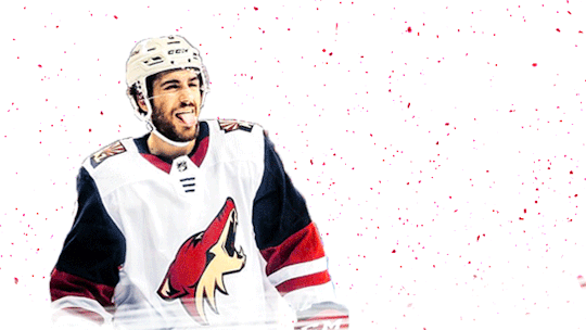
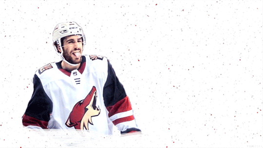
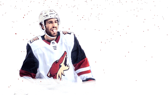
a quick explanation is that i cut out an image, paste it onto a fresh canvas, edit to my desire, and then use a gif overlay on top to give that snow effect!
so i’m going to explain this in as much detail as possible to try and make it as clear as possible, so hopefully this will be useful no matter how much PS experience one has! i used photoshop cc 2017 to make this! i’ve learned ps pretty much through just trial and error so if i do things weird, im sorry sdklfjdslk
start:
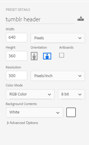
the first thing i do is open a blank document in PS sized to the tumblr header size which is 640x360 on mobile, you can size up if you want, but just keep the ratio the same!
player image:
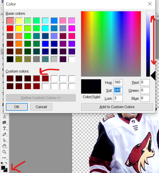
so first i grabbed a picture, and for this i prefer pictures where the player(s) is(/are) isolated, and it’s even better when there’s not much going on behind them because it makes it much easier to cut out the part you want!
the picture i used for this is from this post on the yotes instagram!
next, i open this up into PS, so i have both the photo and the blank canvas (red arrow) open. the blue arrow points to where you can change workspace presets to allow different tools onto your workspace. i’m currently using the photography preset, but will eventually switch to motion later on.
now i begin cutting out my player. there’s multiple methods to do this and each once has it’s pros and cons. the quickest way for me is not necessarily the best way, but it does what i need it to do, especially when the item to be cut out is isolated in front of a quiet background. i use the quick selection tool to quickly select the area i want with a larger brush, and then i go in with a smaller brush size to clean up the edges and details.

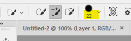
when the option with the plus is selected you are grabbing more area, and when the option with the minus is selected you are are deselecting area. the 22 highlighted above references the brush size, the appropriate brush size, or what is “big” or “small” will depend on the size of picture you’re working on so just play around with what you’re comfortable with!
nick is selected, as you can see below, with the line around his body. this is not quite as careful as i would be if i was actually making this for someone to use, but for demonstration purposes it works. you can zoom in further and use the smallest brush size possible and really be careful cutting things out. you can zoom in but uping the number at the bottom left handside of the screen!

once you have everything selected, right click and choose layer from copy which will create a new layer with just the area you have selected.

now i turn off the layer with the full picture, leaving only the layer i just created. to do this, click the little eye next to the bottom layer on the right hand of the screen, as seen below.

now you’re left with a transparent player to work with! this is where i do any coloring i want to do as well, so i will quickly do that. i am not great at this part so i will just recommend looking up coloring tutorials if you want more specific help here, or just mess around with different adjustment layers which is what i do lol. once it’s colored to my liking, i merge the layers together, making them into one layer, which means the coloring won’t impact any layers below it once i move it to the canvas where we’re actually going to create the header. you do this by selecting all the layers (ctrl + click all the layers or shift + click the top and bottom layers to select them all), and then right clicking and selecting merge layers from the options.
assembling the image:
now im going to work on the base of the header, or basically the rest of it except for the moving bits! what i want to do here is move the player image over the header canvas, resize the image, decide on the color of the background, whether i’ll use any other images or textures, etc.
first i’ll think about my background color of choice. a lot of people use the color that they use for their mobile blog on here, or something complimentary or matching their accent color, etc. i really like a simple clean look so i used a white background for this header because i think it makes the image itself pop and allows the accent colors on my blog to also pop because i use white as my main color on my blog.
if i wanted to use another color, i normally pull from some part of the image i’ll be bringing over. for this i’d use the color dropper tool (see below), clicking on color on my image i want to use.

then i’ll pull up the color boxes in order to create a custom color from that color (click define custom colors), and then you can mess around with by clicking different boxes on the color scale along the right side of the panel below, or if you want an unrelated color, click on parts of the entire rainbow scale thing. once you have a color you like, selected add to custom colors and you can work with it. i create a new blank layer and then use the paint bucket tool to color it in. this is where you could also use gradients to jazz up the background a little too.
now i’ll drag my player over into the header canvas. i do this by click + dragging the layer from the right side over to the tab of the header canvas until the screen changes over to that workspace and then i drop the layer onto the canvas.

and
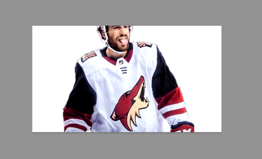
now nick is over on the blank canvas but as you can see, he needs to be resized. so i ctrl + t, which allows me to transform his layer (make sure you only have the layer w the image selected on the right hand side layers panel). i hold down the shift key (this keeps the ratio true) and begin to make him small by dragging the arrows. make sure you do not let go of the shift key too early or it will fuck up the image and make him too long or too wide, etc. then i hit enter, and it completes the transformation. i then drag him to wherever i want him.
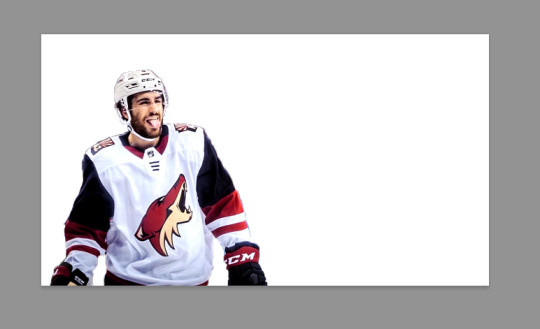
now that he’s resized and where i want him, i mess with the blending options to blend him into the background more pleasingly. now this really isn’t gonna look good since i was so sloppy cutting him out earlier, but just mess around with it until you get something you like. you do this by right clicking on the layer you want to blend and then selecting blending options. i normally do a drop shadow and maybe some other stuff, but i find this changes depending on the image, background, colors, etc.

there’s a lot of stuff you can do here, with the different options and the different settings for each one!
gif overlays:
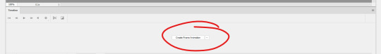
now it’s time to add a gif overlay which i how get the snow falling effect. there’s multiple posts with these kinds of gifs out there, i’ll be using one from this post (method one) and one from this post (method two). neither are the one i used when i first made this header but i cannot find the one i used then; the principles still apply. now is the time to either add the timeline to your workspace, or change it to the motion preset.
on the timeline section at the bottom of the page, there should be a create timeline animation button, click that.
as with gifs from videos, there’s multiple ways of making these gifs. i’ll run through two here.
method 1: this is the method i used when i first made this header!
if you use a gif overlay, and it comes with frames, create as many frames as that gif comes with to then copy those frames onto. open your gif and see how many frames/layers. this one has 29 as you can see below.
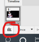
now click the little button with lines at the top right corner of the timeline. it looks like this.
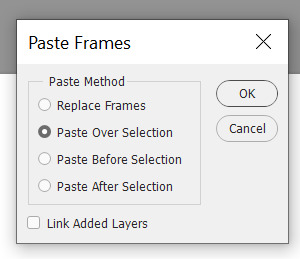
next click select all frames from the menu that pops up, and then select that menu again and click copy frames. now go back to your header and create the frames i talked about earlier, you need 29 (or whatever it may be for your gif). do this by selecting the button below, located along the bottom of the timeline. do this as many times as needed until you have enough frames.
now select all the header frames once again and go back to the menu where you copied the frames and select paste frames this time. a menu will pop up, and choose paste over selection. this will match up the frames/layers so frame one of your header will match with frame one of the gif. adjust the gif size if you need to, once again using ctrl + t, and make sure you still have all the layers selected and that you are still on frame 1. also make sure you move these layers under nick in the layer order.
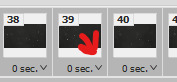
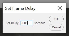
now adjust the frame rate. this will depend on your tastes entirely so test it out. my go to frame rate is 0.05 for everything i do pretty much, as a baseline, and then i adjust from there. to do this, once again select all your frames. next, click on one of these little carots, select other, and input your frame rate in the box that pops up.
method two:
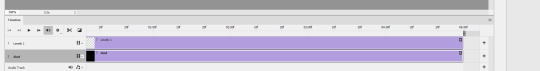
this method is when your overlay comes in timeline form (idr what it’s called) instead of frames, looking like this.

drag the layer from the layer panel onto the header canvas, just like we did with nick earlier. make sure it goes under nick in the layer order. adjust the size if necessary, still using ctrl + f to keep the shape. make sure to click this button at the bottom left corner of the timeline to convert the frame into a timeline.
now, make sure to drag each layer to the same length, aka whatever length the gif layer is. make them match!
changing the color of the overlay:
this works with either method above! create a new layer and fill it with the color you want the snow to be. place it below everything except the background layer. add a gradient layer on top of the gif layer. right click on this layer and click create clipping mask. this is what my layers look like, i don’t normally label them but hopefully this is clear.
open the properties panel for the gradient map and make sure this gradient is selected and is black and white.
finally, change the blending to lighten on the gif layer! this should do the trick!

final touches:
i like to kind of have my header melt into my blog color, so i like to kind of transition the bottom of my header into whatever color my blog is. to do this, i use a multitude of methods. for this header in particular i used the eraser tool + a textured kind of fan brush to swipe back and forth creating the half erased look at the bottom. the setting seen below are probably similar to what i did when i originally did this header!

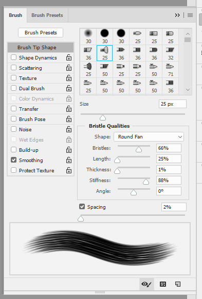
again, this is something that you can play with a lot yourself, especially by downloading brush packs and seeing what cool textures you can create.
saving:
to save, file > export > save for web
make sure you select “forever” and not “once” so that the gif loops!
original:
gif method 1:
gif method 2:
(ignore how this is also different i had to remake it once again bc i didn’t save it lmaoooooo)
5 notes
·
View notes
Link
The following blog post, unless otherwise noted, was written by a member of Gamasutra’s community. The thoughts and opinions expressed are those of the writer and not Gamasutra or its parent company.
Voxel art hasn't been around for too long in popular games media. It had an appearance long ago before polygons were the deciding factor for art/technical direction in games, but that's long forgotten. The reason, simply put, is hardware stress making it impossible for voxels to be a feasible rendering technique in games.
Greebles can be easily explained as "bumps". A Minecraft map, when viewed from afar, looks rather bumpy doesn't it? Well that bumpiness would be called "having a lot of greebles". I hope that helped to clarify the confusion.
When I first started making voxelart in the summer of 2013, it was pretty common to use the form to make "retro-3d-art" like 3D Dot Heroes. It was fun and considerably easy to get results fast so I would often make between 5 to 10 full models a night (5-6 hours). I didn't think much of the resulting poly count when making these models because everything I was producing would be exported and rendered in a Voxel Engine. Voxel engines were good at making you think "oh hey! this should totally be fine on computers to run, I wonder why more studios don't use voxels in games". Well, once I started actually contracting art out instead of modding, I quickly learned how intense voxels really are.
Late 2013 I started working on my first commercial game and, boy, did I learn a lot about Voxel engines. Everyone back then was either using an existing voxel engine or making their own (please don't do this if you're doing this today, for your own sanity) and I had to learn a lot about the inner workings of voxels. Once you start working in a voxel engine you start to observe how much voxels burn through your computer hardware. Various factors play into this stress but if you simply view the polycount, something as simple looking as Minecraft can be extremely memory consuming. Every single voxel will draw 12 polygons at a time, which is a lot for something as insignificant as a piece of dirt. On top of that, if you make a character which isn't a perfect cube, you sure as hell are going to break through 100 polygons for the 1 model, and fast.
Luckily, when working with any engine today, you can export voxel models as polygonal objects (because most, if not all, voxel editing tools will come with exporters for standard 3D formats). This will allow you to take something made up of hundreds of voxels exported with as little polygons as possible.
This is where the fun begins. When I started doing Voxel Art professionally I decided to spend most of my spare time figuring out new voxel art styles. These were all style which ignored the constraints of poly count, so I was still committing a terrible sin of killing my computer graphics card and CPU. When I started making mobile games I realized that this can't do; I needed to make an art style that could reduce the poly count as much as possible so you could still enjoy your games at 30FPS+. Soon enough I realized this became my style. Due to market demand of making voxel art for low spec hardware, I started developing a style which got further away from Pixel Art and Retro Art and got closer to forms like Low Poly Art.
***
Almost every game requires a character and it normally becomes the first thing you make. Voxel characters suck.....so much. You don't have the freedom of making something super rounded or shaped out otherwise your character becomes completely unreadable and technically demanding (high poly count)
Ex: The character below looks to have a functional shape. you can see the defining factors; its limbs, its torso, and its head. "Not bad" you might think....but boy, add in some lighting and it'll become a mess of shadows.
This was one of my first experimentation's with freeform character design in voxels, ignoring the polycount or the squareness of voxels. The idea was to use the extreme and understand what are the pros and cons. The pros here is that you can very clearly define a shape and explain to a player that "X" is an ear. Admittedly, the above design isn't terrible, I'd even say it works, but the moment you add in new factors like animation you run into a massive technical wall. Skin rigging and even Rigid Body rigging become a painful job of making sure the mesh doesn't break itself. Aside from the T-pose model, unless this was animated frame per frame like a Pixel Art piece, it wouldn't come out in an ideal fashion.
When I came to this point in my designs I noticed I need to immediately find a way to reduce the poly count and make it look good. Simply put, I need to make flat design work somehow.
This was one of my first successful animations/rigs, made in a game jam years ago. This made me realize that I didn't need to make models with full arms and legs to be functional in expression. This was likely my first significant step in understanding the "Rayman" Aesthetic as the potential future of voxel character design. You can make hyper-expressive animations without the concern that your arm or leg will look all weird (because nothing is there) and you have less content to make in the long run, even if you make variants to limbs.
This step in my style was defined by my technical capabilities. I wasn't a great animator and I barely knew what I was doing at the time, so when I found something that worked, I stuck with it and refined it as much as possible. Today I've refined myself to the point of using arms and legs, while only using the Rayman aesthetic when the gameplay deems it necessary (ex: Spartan Fist).
These were both later attempts at Character designs. The first one above is from Critical Annihilation. I avoided the Rayman limbs since the game was lightly animated, but even then I felt the character was too stiff. I later made these set of dwarves for a client and I'll point out 2 mistakes I made:
I used noise....far too much. Something I no longer use. Noise will only cloud the design you intend to make. You have no direct control over the result when applying noise and so it no longer feels like something polished.
I used too much stepping to define a design. By this I mean that I made the beards have a 45 degree slant (little steps resulting in greebles).
Admittedly, you can see that I've already reduced the amount of stepping in my models from the first one I showed to now. This was me slowly realizing that I wasn't prioritizing shape/design clarity. When you apply shadows in-game, everything gets blurred out. Additionally i noticed that shadows would hide a lot of details I put into the color work. This lead me to reduce the amount of colors I had in my palettes and focus on the visible design.
***
We're in 2015, I've learnt how to animate a bit, I've started to understand limits of color use when applying lighting to models in-game....Let's throw all that out the window for something new!
For most of that year I worked on a game called Voxelnauts, which had a one of a kind aesthetic; Flat-shaded Voxel Art. The polar opposite of everything I had taught myself to date. Let's ignore the fact that shadows are a thing, and ignore the limits of voxel rendering (because it used a raytracing engine rather than a traditional mesh renderer).
(Voxelnauts, by Retro Ronin)
The character above was not made by me, though I did animate him (gif version can be found on my portfolio site). This model was made by the art director John Su. He taught me a lot:
You can apply shadows manually on objects by coloring the voxels. Imagine the light source and work accordingly. BUT!
Make sure your color gradient on shadows is obvious! Don't be shy, make it contrast both in hue and brightness (the beige skin vs the dark red/pink underarm)
Because it's flat shaded we can make limbs clip into one another and no one can tell!
And lastly, the way you sculpt a voxel model is VERY valuable. EVERY VOXEL COUNTS.
These are all the things I learned, either told by JS directly or things I've noticed as I was adopting the games style. I still take a lot of these points to heart, mainly the way I rig and animate models and the value of every voxel.
When I stopped working on this project I took everything I learned and starting finding designs in voxel art which can utilize an entire body design. I managed to go in a new direction and attempt a model with a full body.
This old man was designed with Luciana Nascimento. We worked together, using her concept art of this old man to make a design which would work in a single mesh. I was once again attempting to make voxels even more reduced in polycount though there were some struggles with this nonetheless.
I still hadn't accrued the skills to properly skin-rig, so making this old man work efficiently was a nightmare.
The coat has stepping, and while it didn't interfere with the model's visuals (it hid things as it should) it was, once again, a nightmare to skin rig.
However, I did gain some knowledge from this:
The head was connected to the body but splitting the head made animating a lot easier, and it had no obvious negative impacts to the look of the head animations (head rotation didn't clip into another mesh).
***
2016! New year, hopefully I get to learn and try a bunch more things. (I did)
I had not used some techniques from the Flat-shaded experience since I thought it was reserved for that aesthetic....nope. I decided to take that knowledge and apply it to some high resolution voxel character. Splitting the meshes based on limbs, similar to the Rayman style, but this time I'll include joint limbs like arms and legs. Additionally, I'll take some knowledge from Flat Shading and model those limbs in a way which makes clipping less of a concern and more of an artistic rule.
Results:
(Settlers Keep, by Foxdawn)
This design took into account MANY things I learned to date and I bet you can see some of those things.
I used colors sparingly; 1 color as the base value for a property and a second color (normally lighter from the base) as the highlight which would contour the objects.
Limbs had variable sizes (voxel density is 1:1) so they would each go into one another. Using, say, a larger shoulder with a slimmer arm socketed inside made animating easier. No need to skin rig, I kept rigid body rigging and it gave the right amount of expression, as seen above.
I made most objects as flat as possible and utilized the rigging/animating process to dictate subtle details (like the feathers bending on the bird).
The above model is very high-res compared to everything I had made previously but it pushed my art forward with all the knowledge I had. When I moved onto another project you'll see that growth even further.
I took the large scale human model and condensed it further to make something a little less demanding yet would still follows the same animation process. This design became a lot clearer as something feasible when my animation and rigging skills got a lot better. Setting this up was simple in principle and the results were fantastic. However, this art direction is only feasible if:
The character design showed a level of importance based on sizes. eg: Character's head is predominantly larger than everything else.
I used the same philosophy as previous: limbs are variable sizes to hide any clipping/Z-fighting
Use contouring colors, except this time it's used to outline important segments instead of everything.
Any shading is done using contrasting colors instead of subtle gradients
Here's another example of using the above rules, to give you a better idea when working with variable creatures and designs. The rules above can also help to make certain designs a lot easier to set up. By avoiding voxel stepping all together and preparing models in a T-pose for rigging, while keeping models as low poly as possible, you have more opportunities to create unique animations and poses, like below:
From Qubicle
To Maya
To Unity!
I became accustomed to a workflow which made my models feel entirely incomplete in the editor. A model was truly complete when it was running in-game. Building out the final design in my mind before doing the groundwork, and working backwards from there. This would be the process:
Keep the final design in mind
Deconstruct the model into limbs or parts which would require animating
Block out the limbs to get a sense of complexity and possibly reduce the complexity from there
Begin modeling
Simplify the design to utilize as few colors as possible but still do some shading on the model directly
Export to Maya
Rig and begin animating!
Seems quite straightforward, but once you get the hang of your tools, you get a better sense of how to make your art before actually making it.
0 notes